These two world clouds superimposed on the map of the United States represent the change in genre choice from 1980-1995 to 1996-2010. Unfortunately, our data set did not include any form of geographical data whatsoever. Our team played with the idea of having to go through every single song and finding where each song was produced or where each song writer was born, however we soon realized that with over 15,000 entries this would take far too long. We chose the year 1995 to separate these two time periods because it represents the advent of the internet and thus the beckoning of a new era of music created through digital means. There is a dramatic change in genre preference between these two world clouds, for you can see that before 1995 Hip-Hop and Electronic music were almost non existent on the Billboard Top 100, however, after, they were quite prevalent, especially Hip-Hop. Hip-Hop and Electronic music are primarily produced using digital synthesizers, a technology that was just coming out in the late 1990’s. There is also a wider diversity of top genres from the first map to the second map which we believe is due to the internet’s ability to vastly increase music distribution.
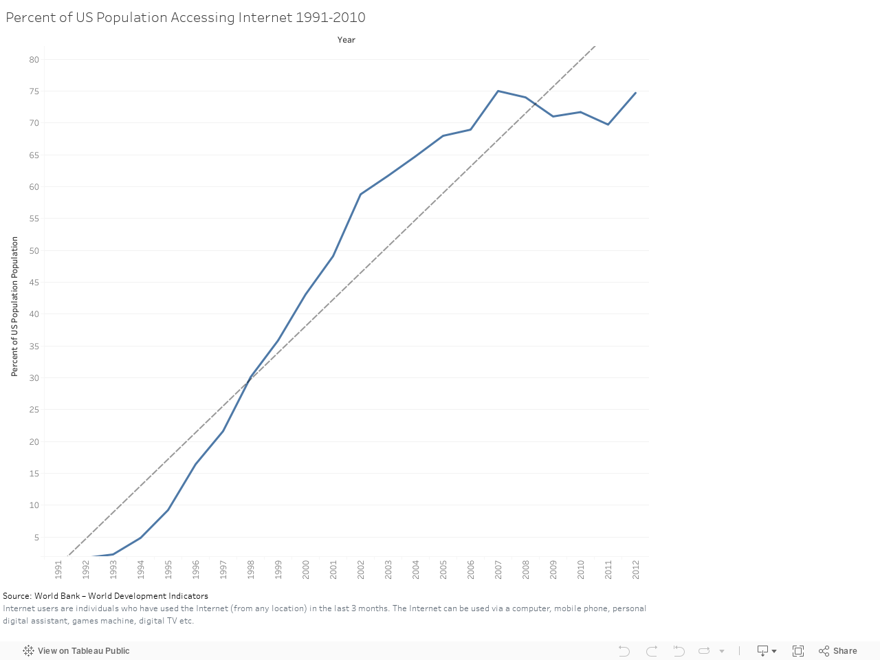
Since our hypothesis revolves around the rise of the internet, it important to look at the Billboard Hot 100 data in perspective. This graph shows internet usage in the US from 1991 to 2010. When analyzing the rest of our data, this data became valuable to see which trends may correlate with the particular spikes in US internet usage. From this data, we have pinpointed 1995 as the year that internet usage really took off in the US.
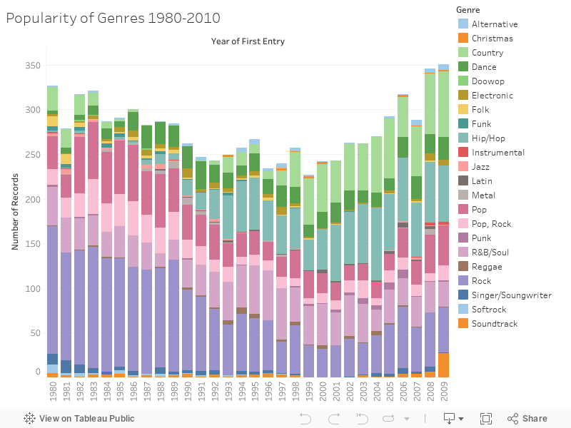
This bar graph visualizes the most popular genres on the Billboard Top 100 chart between 1980 and 2009. The visualization gives particular insight into when genres were the most popular individually and also in context with other genres. From this, the fall of rock and the rise of hip-hop and country are notable. Focusing in on the year 1996 which is only one year after 1995, which we have established as the beginning of this time period––it is the bottom of a 15-year decrease in the number of individual genre tags on the chart, while also the starting point of a steady gain in the number of genre tags and total records on the chart per year until 2009.
The maximum point in the data comes in 2009 when there were 351 distinct records. Country was the most popular genre that year with 74 songs on the Hot 100; Hip-hop came in second with 63 records.
The maximum point in the data comes in 2009 when there were 351 distinct records. Country was the most popular genre that year with 74 songs on the Hot 100; Hip-hop came in second with 63 records.
|
|
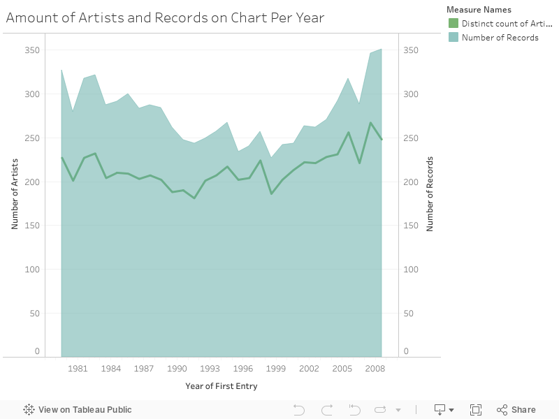
This visualization shows how many individual songs and artists appeared on the chart for any given year between 1980 and 2009. The main blue area graph shows the number of songs while the green line shows the number of artists. Generally, the paths for number of artists and number of records follow a similar path, although separated by about 100 at the largest gap and 30 at the smallest. The larger gaps indicate that there were many artists who charted multiple songs in the same year, while a closer gap indicates that less artists had repeat hits in the same year. When looking at this graph through the lens of diversity, we can see that a a peak for both number of songs and number of artists comes at the far right for the year 2009. This would support our hypothesis that diversity has increased over time because never in this 30 year chart do we see a time when more songs and more artists were represented on the chart during a given year. It is also interesting to note that the late 1990s showed the least amount of both artists and songs during the 30 year period. Since we established that the internet began to rise in 1995, we can see the correlation between the rise in internet usage, and the the rise in both number of charting artists and songs.
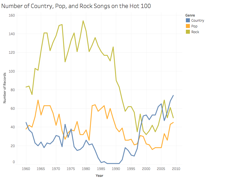
This visualization shows how the genres of pop, country, and rock change in their popularity over time. There are a few things that should be noted within this graph. Firstly, the genre of rock is extremely high in popularity with the number of records maxing out the amounts for the year at 150 songs at the highest. Unfortunately for rock music this trend drops drastically in 1995 where it reaches its nadir in 2000. Both country and pop have a decline in 1995 too. During this year it is the first time that internet streaming is possible. Country music has the lowest amount of songs until this break in 1995 where the date spikes reaching 71 songs in 2010. Finally, pop music also experiences some interesting trends. It by far is the most consistent of the bunch in terms of amounts. However, in 1995 it mimics the trend seen in Rock but at a much lower level reaching only 43 songs in 2010. It is important to note, though, that the height of pop music on the charts only reaches to 65 songs.
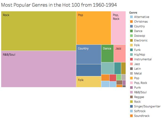
This visualization is a tree chart of the amount of songs on the hot 100 between the years of 1965 and 1995. Rock is the number one genre with 4,126 songs. R&B/Soul comes in second with 3,815 songs. Pop comes in third at 1,633. When looking at the hierarchies that exist in this chart we see genres that continue to be popular into 2010. Interestingly the song’s genres are also well known. If asked to name a few genres off the top of your head “pop, rock, R&B” might come to mind. The smallest genre represented between 1965-1995 is Latin. Is this a factor of there being more pop songs in the world versus Latin ones? In further studies, it would be interesting to plot at all formally released songs versus the amount we see in this tree chart. Perhaps there is a hierarchy that exists between the popularity of songs and the technologies that allow us to mass produce them.

This visualization is a tree chart of the amount of songs on the Hot 100 between the years of 1994 and 2009. This chart depicts data shifts in the genres that dominate the charts. While Rock and R&B/Soul still remain in the top—they shrink drastically. Where between 1960 and 1994 rock and R&B were the main, overpowering, genres following this era the power is more shared. There are more genres that exist in the top positions. Some these genres are dance and hip hop. Hip hop perhaps sees the biggest growth between the two tree charts. Pop music is also an interesting case. Where pop used to be the third largest genre, following 1994 it drops down to being the 6th largest. Interestingly there is a cleaner mix-up of genre sizes, where there is more variety in the sizes of genres represented.
